5 Things That Excite Us About Our New Website

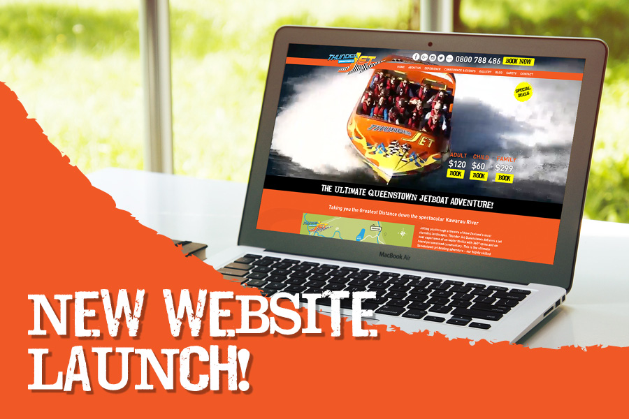
After quite a few months of planning we are extremely excited to finally have our brand-spanking revamped website set free into the wild this week. You might be thinking, what could possibly have changed so much that it deserves such a fuss? Well, let us bring a few of it’s new features into light.
- Mobile friendly
This has been our chief priority on the website redesign. Even if you’ve been following us for a while now, please go to your phone’s browser and go to: thunderjet.co.nz. Ah, isn’t it amazing? We are now proud to announce a clean, user-forward and mobile-friendly service!
- Beautiful new gallery
We’ve listened to the feedback from you and have kept our promotional photos in our gallery for you to download at your leisure, but we’ve also added in our Instagram feed so you can see everything that we’ve been up to at a glance. Now, isn’t that cool? We think so too.
- Easier to use
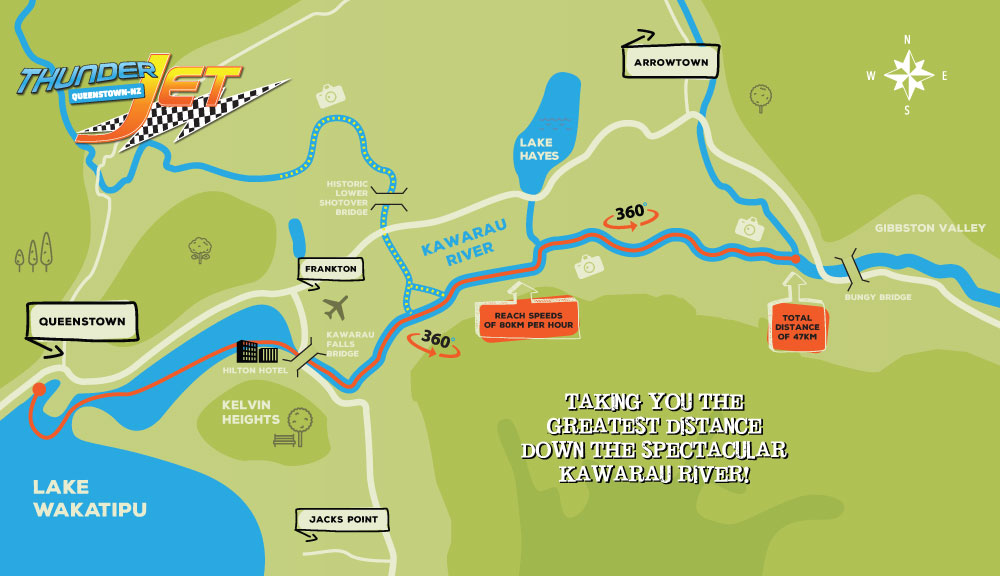
You’ll find everything just where you suspected it would be. Pricing is right there – you can’t miss it, what we offer, and of course, an interactive journey map for your information and entertainment!
- All kinds of ‘pots of gold’
We’ve provided you with an outlet in the form of this epic blog to keep you updated with all things Thunder and whatever else may be thought-provoking at the time… If there’s something that you’d like to know from the world of jet boating then please leave a comment and we’ll endeavour to bring you the goods!
- The ‘fresh’ new look
As Thunder Jet has such a big personality, we felt we needed an impressionable website that reflected our character and brand. We’ve gone for a look that is full of motion, interactive, and encompassed in bright colours and fonts.
Thank you for following us and our journey so far. We’d absolutely love to hear any feedback that you may have so if you could please leave a comment if you think there’s something else that we should know. Also, if you loved the post and you want others to know about it too then please share the love!


